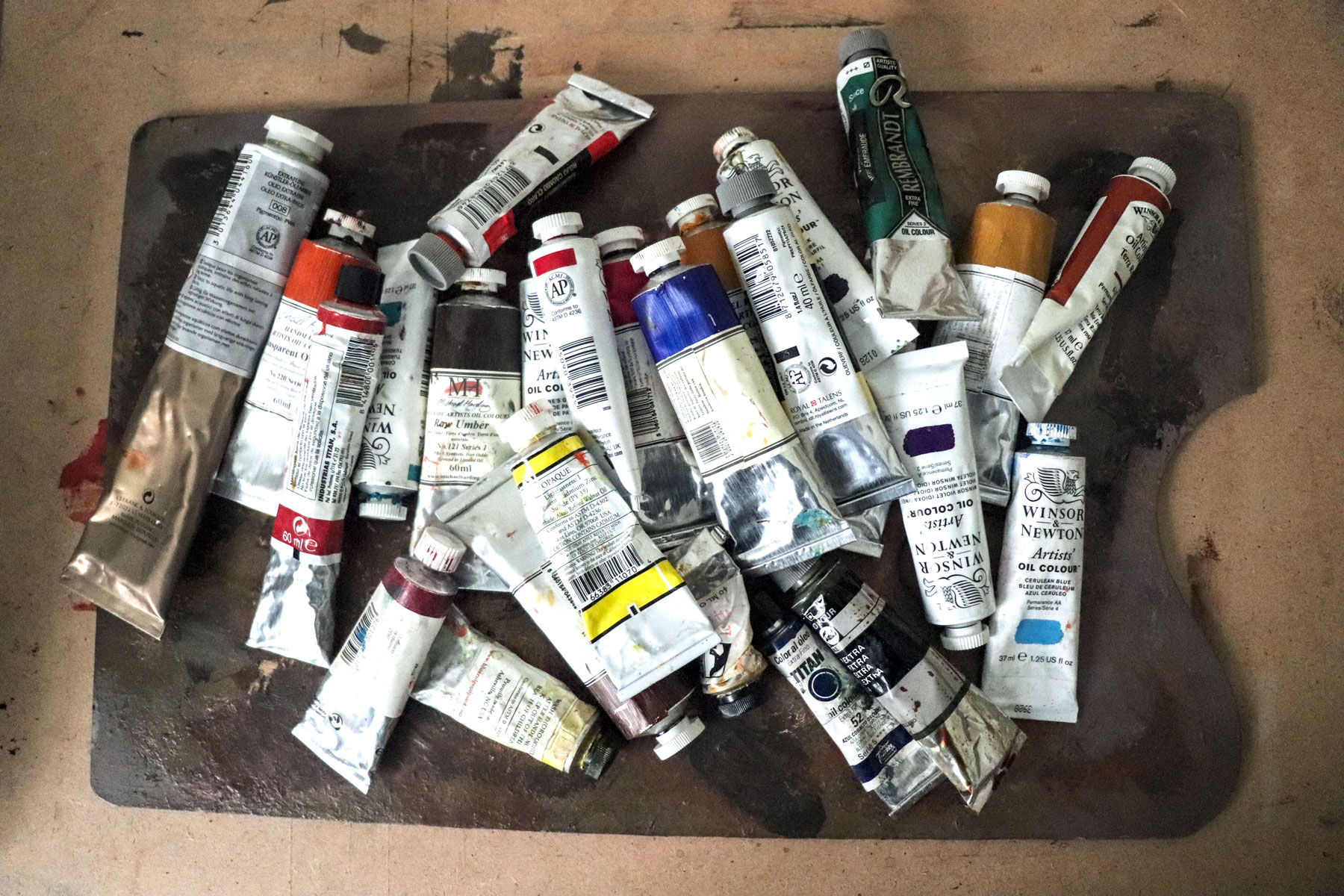
After all that has been written about the oil color palette I have decided to add my own contribution. I do it because I would have liked to find something similar, to put my thoughts in order, when I began to worry about this issue in the old days of the academy. And also because in my experience organizing painting workshops, other fellow artists have encouraged me to do so hoping that it could be useful to them.
The keys to selecting your own oil color palette could be summarized in four staments:
- Understand the color theory at least in a simple and practical way for the painter.
- Understand the different oil color palette options to choose the one that best suits your painting preferences.
- Learn to recognize and choose the different commercial colors.
- Have a list of good sources of information.
Finding a method
In becoming a painter, most of us start with the oil color palette suggested by a teacher or a classmate. We do not usually question much more and from there we evolve in a more or less intuitive (test / error) way. Then, after studying the palettes of different artists, it becomes evident that there is no unique answer and that there is a marked component of personal preference. It is this variability that makes hard to deduce a selection pattern or method. That is, precisely, the objective of this article: It is not about defining a single, universal answer but to devise a method that helps you to choose your own personal solution.
By the way, remember that having a good oil color palette by no means meant to paint well. Many great painters used a simplified or tonal palette (see the case of Anders Zorn) and others an extravagant palette of many colors. This is all about helping you to get an instrument tuned and adapted to you which you can approach by making your own informed decisions.
Color theory for painters in five minutes
Let’s do an extreme synthesis exercise. If you want to deepen in the study of color (always advisable), at the end of the article I leave you some very interesting links with tons of information but, from the point of view of the most useful tips for the painting practice, we can highlight here some essential concepts:
Color can be defined by three characteristics:
- Hue: is the quality of the color; Light yellow, medium red, black, etc.
- Saturation: measures the purity of a color, ie the degree of brightness and intensity it has.
- Value: measures the darkness or lightness of the color, ie if it is tending to white or black
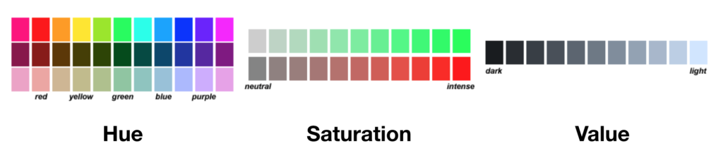
Attributes of Hue, Saturation and Value, © 2015 Bruce MacEvoy, Handprint
The mix of solid colors which is the one used by painters is called subtractive mix and it starts from three primary colors which receive that name because ideally they can not be achieved by mixing two others. In practice, it has been found that the three best primaries are: yellow, cyan and magenta. It is the same system that is used nowadays in color printing, named by its acronym in English CMYK in which the K corresponds to black (Black).When mixed, the three primaries produce black (actually, more or less dark grays depending on the chosen primaries, this is why in the CMYK system black is added.
According to the classical theory of color, the other colors are obtained by mixing each primary with its adjacent one. These mixes creates three more colors that would be the secondary ones. In the same way, by mixing each color obtained with its adjacent two, we would obtain the tertiaries, etc.
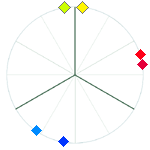
This is where it gets a bit complicated because there are different theories about how to organise and represent colors. As painters, we do not need the scientific depth of some systems so we will resort to a simplified system of representation consisting of a chromatic wheel that in the center would have black and in which the most saturated colors are located in the outermost part of the wheel. An imaginary vertical axis would indicate changes in lightness (value) (Figure 1)
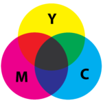
Substractive primary colors (yellow, Cian, Magenta) and their secondary mixes
When mixing colors for painting we have to keep in mind some very important facts:
- Saturation Cost:
Every time we make a mixing in which the three primaries intervene, in any proportion, we will be graying the color, that is to say, losing saturation or intensity. But not only is the mixture of the three primaries, the “saturation cost” predicts that any two-color mixing always produces a loss of saturation in the resulting color. This effect is more pronounced the more separated the two starting colors are in the color wheel - Complementary colors
We call complementary to the colors that are directly opposite on the color wheel. The mixture of two true complementaries always tends to neutral (gray) more or less dark depending on the starting colors. This is very important because it is used constantly to adjust the saturation in the colors we mix and because if we choose the right complementary colors we can get very intense dark. - Selection of the primary colors
The main practical problem for painters is that we work with the real pigments available, not those of an ideal color wheel. In fact, it has been with the appearance of synthetic pigments that we have begun to approach the perfect primaries, (yellow, magenta and cyan). Of course what we mean by classic red (medium cadmium red) or typical blue (ultramarine for example) make some unsuitable primaries with which we get purples and greens unsaturated and grayish. - Cool and warm colors
The concept of warm and cool colors arise from a subjective and abstract distinction since it is not an intrinsic quality of color. Nevertheless is very useful in painting since it is intuitively understood by anyone and because, if it is well managed (for example, for rendering the natural contrast between warm and cool qualities of lights and shadows as explained by Vincent Desiderio) can let you avoid common mistakes that translate into chalky or muddy paintings.
To this regard the warm colors are those sitting between the yellow-red segment and the cold ones between blue and green. This way we can “cool” or “warm” a color by bringing it towards the corresponding segment (Fig. 3)
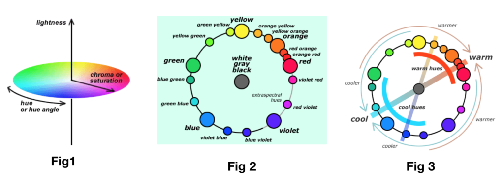
Fig 1. The geometry of color making attributes in a modern color space, Fig2. perceptions of spectral hues form a hue circle, Fig3. the warm/cool contrast, © 2015 Bruce MacEvoy, Handprint
Looking for the largest tonal range
At this point we must make an important consideration: the method that we are going to follow, is based on the premise that we want to choose an oil color palette that allows us to achieve the widest and least limited color range possible. Now, from the artistic point of view this is not necessary at all. As I said before, great artists of all times have chosen to use a limited oil color palette. On the other hand, as James Gurney explains or as beautifully shown by artists such as Ruprecht Von Kaufmann, one can selectively choose zonal palettes (cold or warm, dark or luminous) depending on the represented theme. In fact, the use of a limited oil color palette forces you to better understand the relationships between colors and value.
The process of selecting your working oil color palette will be a continuous process of adjustment and has a lot of personnel, however, this article is designed to define a palette of a full tonal range so, only to this purpose, we will left aside the simplified oil color palette and will based the method on the following objectives:
- Select an oil color palette that allows to achieve a chromatic range as wide and less limited as possible.
- Understand how to choose between the different (thousands) of colors available on the market
- Build up an oil color palette that is simple and effective to mix and obtain the desired color.
Oil color palette options
Given the previous considerations we can consider two basic options:
- The split color palette) one pair of colors per each primary
- The secondary palette (composed of 3 pure primaries and three pure secondaries
The split primary oil color Palette
The Split primary palette, © 2015 Bruce MacEvoy, Handprint
This is a very common oil color palette nowadays. To avoid the problem of the low saturation mixes that we get when starting from only 3 primaries the proposed solution is to use a pair of colors for each primary, Each one of them is tending to one or the other side of the chromatic wheel. For example; Lemon yellow and medium yellow (one tends to greenish and the other to reddish) In that way with the first we will get more saturated greens and with the second more intense oranges. The same approach is taken with red (medium red and bluish red) and with blue (blue greenish blue and reddish blue). Indeed this palette widens the chromatic range and saturation of the secondaries but it is still somewhat limited and since we are choosing 6 pure pigment colors, many agree that it is better option what we call the secondary palette
The secondary oil color palette
Don’t forget that our goal is to achieve the widest possible color range (we can always “gray” the colors out if we need to) with the simplest possible approach. If we do not want to lose saturation along the whole color wheel the strategy to build up the secondary oil color palette would be:
- Choose 3 suitable primaries that as we have already seen should be close to a neutral yellow, magenta and cyan.
- Instead of mixing them, we choose the 3 secondary colors among the pure pigments available, in a way that their location is strategically covering the largest possible path of the color wheel. ( a red orange, a reddish blue and a yellowish green)
- Finally, and this is very personnal, we will complete our selection including some convenience colors based on two criteria:
- locating some color that covers areas in the color wheel to expand the saturation chromatic range (for example some red or blue-green pigment)
- Including some tones that you personally consider that you like or will use more frequently and that although you can get by mix, you could find more convenient to have them ready and at hand from the beginning. (for example yellow ochre, transparent oxide red, neutral greys like raw umber or payne’s grey, etc)
With these criteria we can build an oil color palette with a wide range of saturated colors, flexible and simple to use of about 12 colors.

Secondary basic palette and secondary color palette plus convenience colors. Images © 2015 Bruce MacEvoy, Handprint
Now that we have the basic structure we can choose the colors.
Work with pigments and not with colors!
The artistic colors consist of two fundamental components:
- The pigment/s; natural and synthetic
- The binder/medium which in the case of oil colors consist of different types of oil depending on the pigment and the manufacturer, being the most common one linseed oil.
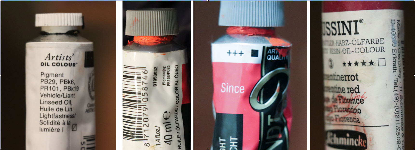
Fig 4. Different brands displays the Attributes of the Colour paint differently
You may find it curious to know that although there are hundreds color names and trademarks waiting for you on the shelves, most of them are made with only 30 pigments! And of these, we can extract a few essential that will allow us to build our secondary palette (we have already said that around 12 seems to be the magic number). The commercial designation as its own adjective indicates, is devised to sell more easily. But what should really matter to us is the pigment included in each color. In most brands, if you look carefully (because it is not usually very visible, (Fig 4 and 5) you will find the pigment that each tube has incorporated. The description of the pigment is governed by a fairly simple color index used by all manufacturers. The coding system consists of 3 symbols:
- The letter P, abbreviation of pigment (sometimes N to designate a natural pigment)
- A letter corresponding to the 10 basic color categories: R for red, O for orange, Y for yellow, G for green, B for blue, V for violet, Br for brown, W for white, Bk for black and M For metallic
- Finally, a number that, for us, only has importance as a reference and that corresponds to the order of registration of the color in the database of the color index.
For example PV19, is a violet pigment registration number 19 which chemically is called quinacridone violet.
Other important characteristics to take into account when selecting the pigment are:
- Lightfastness: measures the stability of a pigment to endure the light. Normally expressed as by the ASTM standard: I excellent, II good, III poor
- Opacity: is usually set in three grades: opaque, semi-transparent and transparent. Usually represented by a square: white square-transparent, square with a Diagonal-semi-transparent and black square-opaque
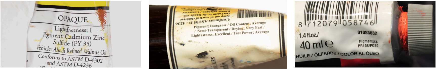
Fig 5. Different brands displays the Attributes of the Colour paint differently
The rule of thumb here is that you choose your colors based on pigments and their properties of lightfastness and opacity and not on the commercial names. Each manufacturer has its own criteria that of course often do not match the others.
We will go into more detail about all this stuff in future posts in which we will analyze for each type of hue which ones are the most suitable pigments that can configure our departure palette.
Do not forget to leave your comments and suggestions that are always welcome.
Recommended Links and lectures:
Handprint: Here you can find one the most impressive and complete information about color theory, pigments and color palettes, conceived for watercolour although most concepts are completely translatable to oil paint as well. Included is the invaluable Artist color wheel that you can download in high quality pdf for free. Created by Bruce Mcevoy.
James Gurney Website: Excellent and inspiring website with tons of useful information. James Gurney book “color and light” is an absolute bed time reading.
Color of Art Pigment Database: An Artists Paint and Pigment Reference with Color Index Names, Color Index Numbers and Chemical Composition
Josef Albers, “Interaction of color”: See the comments and the links to the app and the book by one of the most important color sages ever.
“Color Choices” by Stephen Quiller, A very well organised book to develop your sense of color and harmonious color relationship in painting
The Dimension of color: This website presents an account of the dimensions of colour and light perception, written for painters using either traditional or digital media
“El color de la Pintura” by Jose María G. Cuasante, in spanish. A study on color adapted to painting by one of the most important color theorists. Great artist that I had the fortune to have as a teacher
“Introducción al color” by Cuasante, Cuevas Riaño y Fernández Quesada. in spanish. A broad approach to color from many areas of knowledge.